
Did Sony mix up the colors? New DualSense sparks controversy among PS5 owners
Translated with AI from the Russian original.
The new translucent DualSense controllers from the Prism Collection have sparked debate among PS5 owners: gamers are bewildered by the color names, which they claim do not match the shades shown in advertisements.
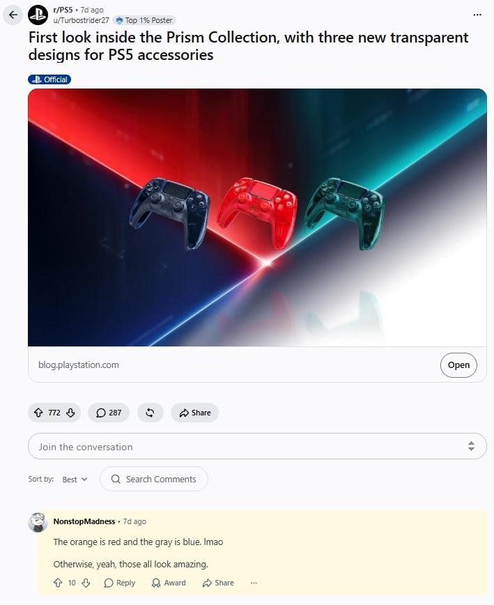
Sony decided to bring back the 1990s trend of translucent electronics and introduced the Prism Collection accessory lineup. It includes glossy DualSense controllers and interchangeable PS5 console covers in three colors: gray, green, and orange. Not everyone liked the idea: social media users quickly found a reason to mock the manufacturer.
The main complaints concern the shade names themselves. According to gamers, the orange version looks more red, while distinct blue tones are noticeable in the gray one. In the comments, users point out that the colors in the promotional images do not match Sony’s labels at all.

However, the company’s designers explained that the discrepancy was intentional. Due to the translucent body construction, the shades shift depending on material thickness and lighting. The orange color takes on a pink tint in thicker sections, gray was intended as the cold color of a stormy sky, and deep green looks more three-dimensional thanks to the case's transparency. What gamers took for an error in the names, Sony considers a planned visual effect.
Never miss our newsAdd this site to your preferred sources to see us more oftenAdd on Google