New IXBT Games Design - New Opportunities
Our website will soon be 18 years old (quite grown up), and it's time to update again. Our previous update was in 2020, but since then a lot has changed - the team has grown, new design trends have emerged, and the Internet itself has changed a lot. Now it's time for us to change too.
Firstly, we have updated the website engine. Previously, all pages existed as separate files, there was no uniformity, but now they are assembled, cached, take up much less space and, as you may have noticed, the site has become faster to load. This has allowed us to implement several additional functions and plan new ones, which we will definitely talk about.
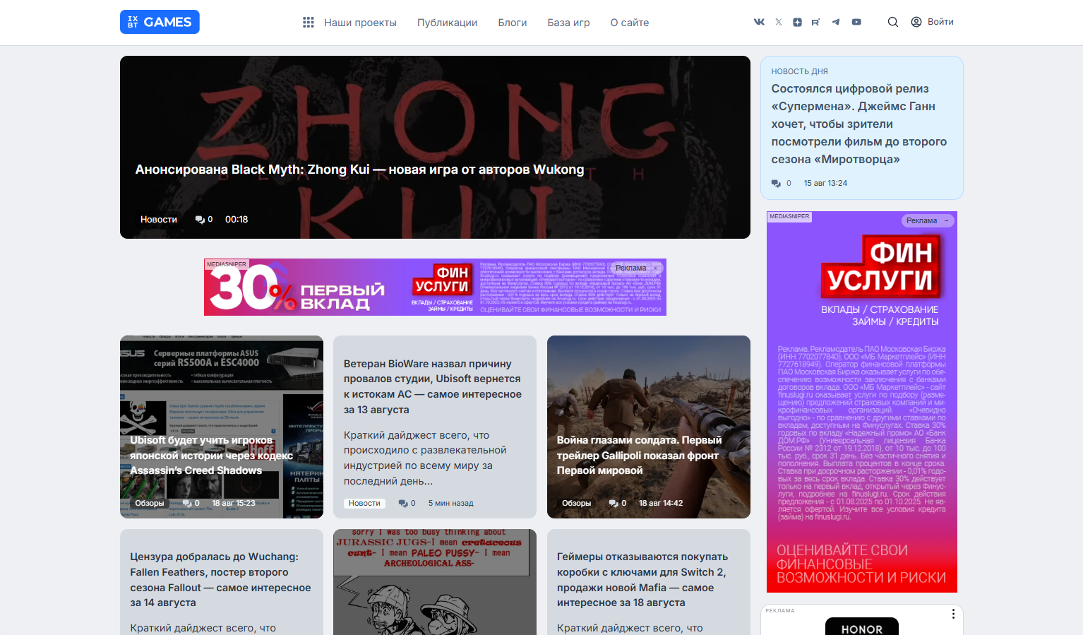
Secondly, we changed the appearance. Yes, it's still the familiar two columns, but they have become more logical and informative. The main page now shows not only the latest publications, but also fresh materials from each section, grouped into their own blocks. A place on the Main page was also found for readers' opinions from IXBT Live in its own block.
News has moved to the right column and is now visible on any page of the site. Now you don't have to be afraid of missing events while reading a fresh review or interview. There is also a "News of the Day" block, in which we show the most important news for the current day or a digest of the main news for the previous day.
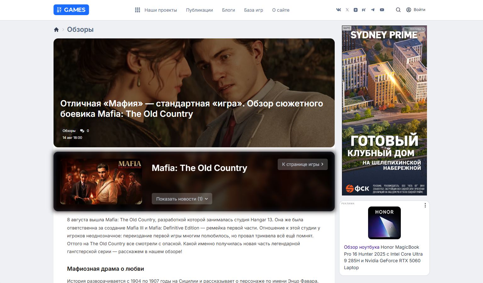
Updated the game catalog and added game cards to articles - it has become much more informative and clear. And in the cards we show news about the corresponding game.
We have redesigned the video player, removed bugs, and sped up its work. Watching videos about your favorite games has become even more convenient.
We have practically no sharp corners left, which corresponds to most modern operating system interfaces and looks more organic. And the appearance of the site has become more like our parent project IXBT.com. On the news and article pages, we changed the layout so that the text looks cleaner and there are no unnecessary elements. And even changed the fonts.
Thirdly, we updated the logo. The new logo retained the familiar letters, but got rid of morally outdated elements and now looks more organic both on the site and on other platforms. We also refreshed the design of other platforms, by the way, so that everything is in the same style (but you may have noticed this earlier).
Fourthly, we brought back the comments. And we added a new moderation system and new commenting rules to them, which are the same for all projects. Yes, you still can't swear at us, we value freedom of expression, but we encourage you to do it politely. And neural networks will help us with this, so that no one will be offended.
Working on the new design, we focused not only on speed, but also on convenience. As designer John Maeda said in his "Laws of Simplicity", you need to get rid of the unnecessary and add the necessary. We have successfully implemented this by creating the most simple and understandable interface for both mobile and desktop versions. Our team has done a great job to make it convenient and beautiful for all our readers.
Комментарии