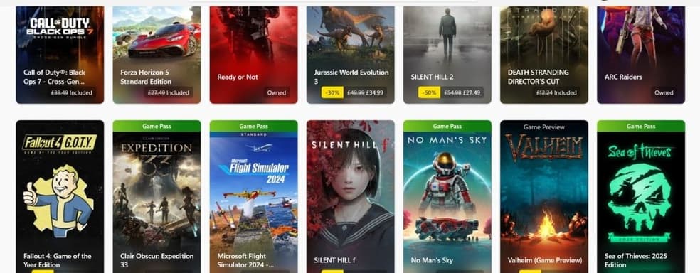
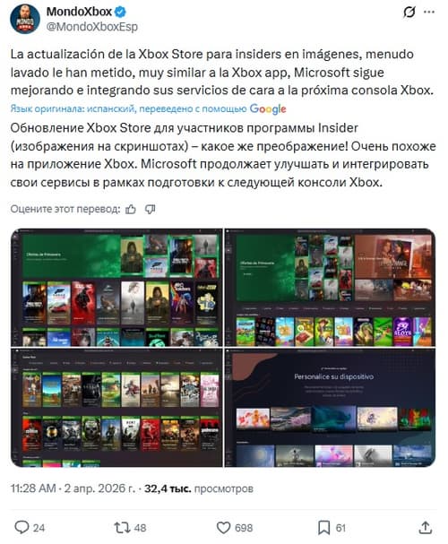
The new look is so refined and aesthetically pleasing that fans are rubbing their eyes in amazement – suddenly this forgotten store looks more modern and attractive than the main Xbox app.
The focus is on elegant rectangular game cards, which have replaced the old, somewhat clunky tiles. Combined with the dark color theme, it all looks fresh and clean. Users who have already tested the updated interface praise it not only for its visual layer but also for its smooth operation. Navigation between products has become fast and intuitive, making browsing the catalog in search of new deals finally no longer an irritating experience.
Additionally, many are wondering whether this unexpected leap in quality will be just a local fix or the first public presentation of the direction in which Project Helix is moving. Perhaps Microsoft is testing new visual standards that will ultimately unite all their services into a single, cohesive next-generation system.
Комментарии